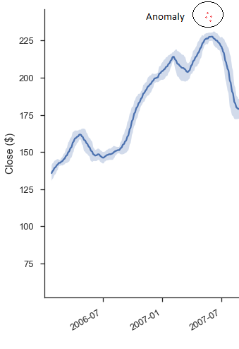
Anomaly detection in time series with Prophet library
Anomaly detection problem for time series can be formulated as finding outlier data points relative to some standard or usual signal. While there are plenty of anomaly types, we’ll focus only on the most important ones from a business perspective, such as unexpected spikes, drops, trend changes and level shifts by using Prophet library.
You can solve this problem in two way: supervised and unsupervised. While the first approach needs some labeled data, second does not, you need the just raw data. On that article, we will focus on the second approach.
-
Originally posted on Medium.
-
Github repo
Generally, unsupervised anomaly detection method works this way: you build some generalized simplified version of your data — everything which is outside some boundary by the threshold of this model is called outlier or anomaly. So first all of we will need to fit our data into some model, which hopefully will well describe our data. Here comes prophet library. For sure you can try more or less powerful/complicated models such arima, regression trees, rnn/lstm or even moving averages and etc — but almost all of them need to be tuned, unlikely that will work out of the box. Prophet is not like that, it is like auto arima but much, much better. It is really powerful and easy to start using the library which is focused on forecasting time series. It developed by Facebook’s Core Data Science team. You can read more about the library here.
To install Prophet library can be installed through the pypi:
pip install fbprophet
We will be working with some sample data, which has some interesting outliers. You download data here and it looks this way:
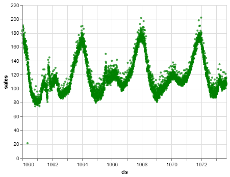 Some random timeseries
To train the model we will define basic hyperparameters some interval_width and changepoint_range. They can be used to adjust the width of the boundary:
def fit_predict_model(dataframe, interval_width = 0.99, changepoint_range = 0.8):
    m = Prophet(daily_seasonality = False, yearly_seasonality = False, weekly_seasonality = False,
                seasonality_mode = 'multiplicative',
                interval_width = interval_width,
                changepoint_range = changepoint_range)
    m = m.fit(dataframe)
    forecast = m.predict(dataframe)
    forecast['fact'] = dataframe['y'].reset_index(drop = True)
    return forecast
pred = fit_predict_model(df1)
Fitting prophet model
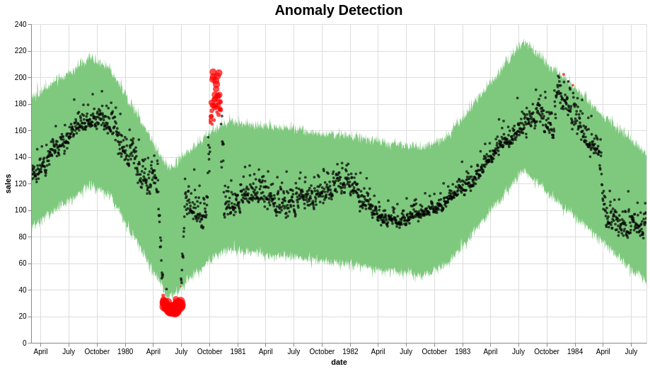
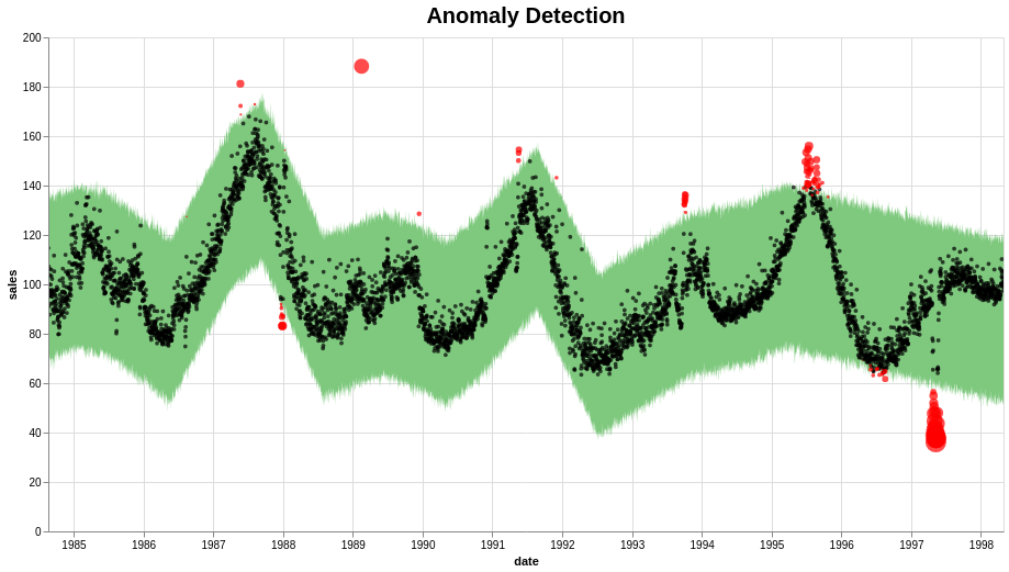
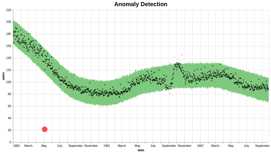
Then we set as outliers everything higher than the top and lower the bottom of the model boundary. In addition, the set the importance of outlier as based on how far the dot from the boundary:
def detect_anomalies(forecast):
    forecasted = forecast[['ds','trend', 'yhat', 'yhat_lower', 'yhat_upper', 'fact']].copy()
    #forecast['fact'] = df['y']

    forecasted['anomaly'] = 0
    forecasted.loc[forecasted['fact'] > forecasted['yhat_upper'], 'anomaly'] = 1
    forecasted.loc[forecasted['fact'] < forecasted['yhat_lower'], 'anomaly'] = -1

    #anomaly importances
    forecasted['importance'] = 0
    forecasted.loc[forecasted['anomaly'] ==1, 'importance'] = \
        (forecasted['fact'] - forecasted['yhat_upper'])/forecast['fact']
    forecasted.loc[forecasted['anomaly'] ==-1, 'importance'] = \
        (forecasted['yhat_lower'] - forecasted['fact'])/forecast['fact']
    return forecasted

pred = detect_anomalies(pred)
Then you are ready get the plot. I recomend to try altair library, you can easily get interactive plot just by setting adding .interactive to your code.
def plot_anomalies(forecasted):
    interval = alt.Chart(forecasted).mark_area(interpolate="basis", color = '#7FC97F').encode(
    x=alt.X('ds:T',  title ='date'),
    y='yhat_upper',
    y2='yhat_lower',
    tooltip=['ds', 'fact', 'yhat_lower', 'yhat_upper']
    ).interactive().properties(
        title='Anomaly Detection'
    )

    fact = alt.Chart(forecasted[forecasted.anomaly==0]).mark_circle(size=15, opacity=0.7, color = 'Black').encode(
        x='ds:T',
        y=alt.Y('fact', title='sales'),
        tooltip=['ds', 'fact', 'yhat_lower', 'yhat_upper']
    ).interactive()

    anomalies = alt.Chart(forecasted[forecasted.anomaly!=0]).mark_circle(size=30, color = 'Red').encode(
        x='ds:T',
        y=alt.Y('fact', title='sales'),
        tooltip=['ds', 'fact', 'yhat_lower', 'yhat_upper'],
        size = alt.Size( 'importance', legend=None)
    ).interactive()

    return alt.layer(interval, fact, anomalies)\
              .properties(width=870, height=450)\
              .configure_title(fontSize=20)
  plot_anomalies(pred)
Finally we get the result. They seems to be very reasonable:
- Github repository with code and data
- Kaggle code with data by Vinay Jaju